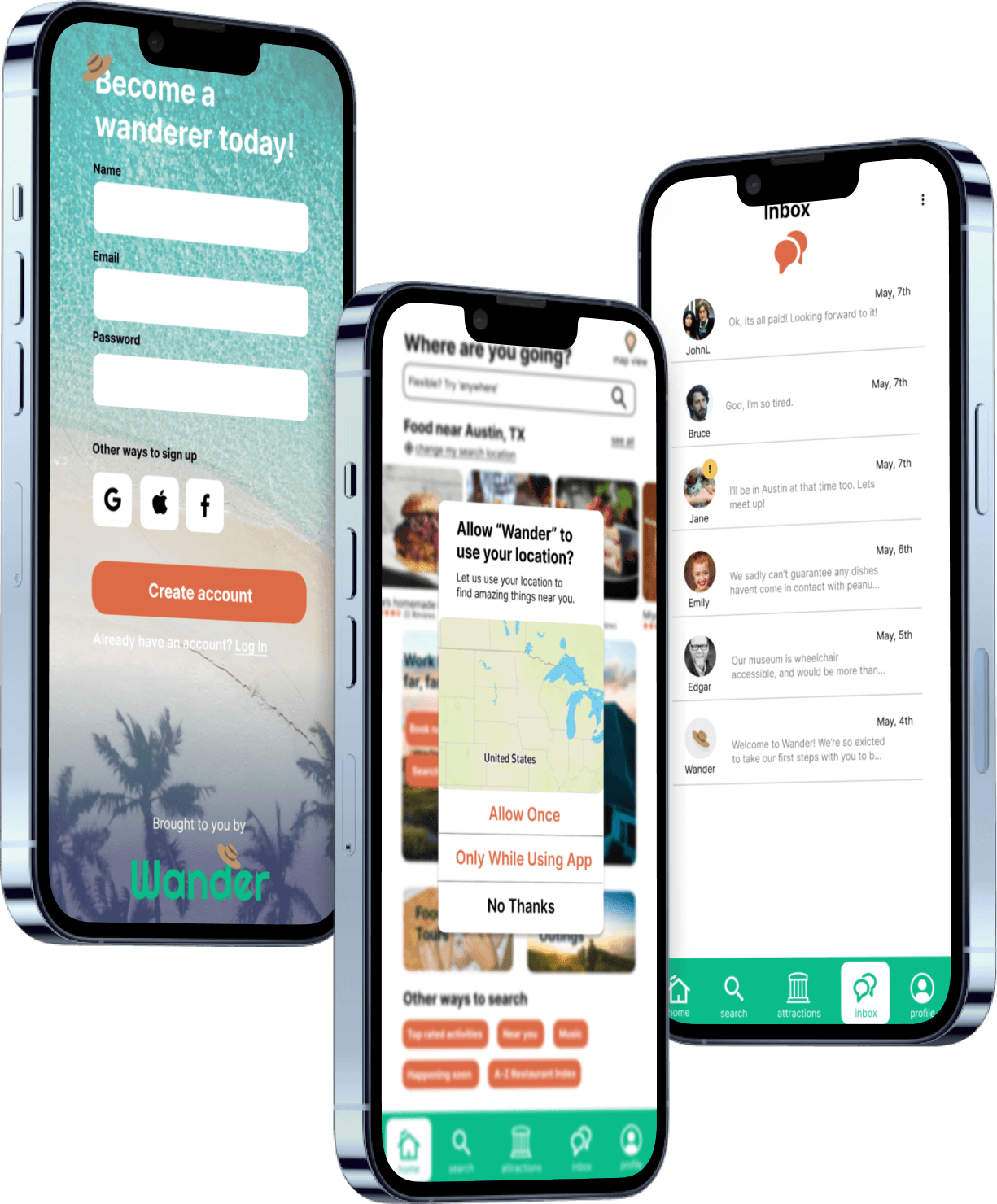
Wander Travel App
Wander is the capstone project made over the course of my UX/UI Design Apprenticeship Cohort. I worked as part of a team with 5 other designers and received regular guidance and feedback from our cohort instructors and fellow apprentices.
By the end of the project, I worked with my team to create an appealing design and confirmed interest through user research and usability testing to put together a functional MVP prototype.
Project Summary
Project duration:4 months
Role:UX UI Designer
Team Size: 5
Introduction
Phase Summary
🌼Gathered and analyzed information for a competitive audit
🌼Conducted a user interview
🌼Synthesized group user interview findings into an empathy map
🌼Added questions to a quantitative survey to confirm user interview findings
For our research, my team conducted a competitive audit to analyze expectations and market gaps, user interviews to understand traveler habits and needs, and a quantitative user survey to validate our interview findings.
Competitive Audit
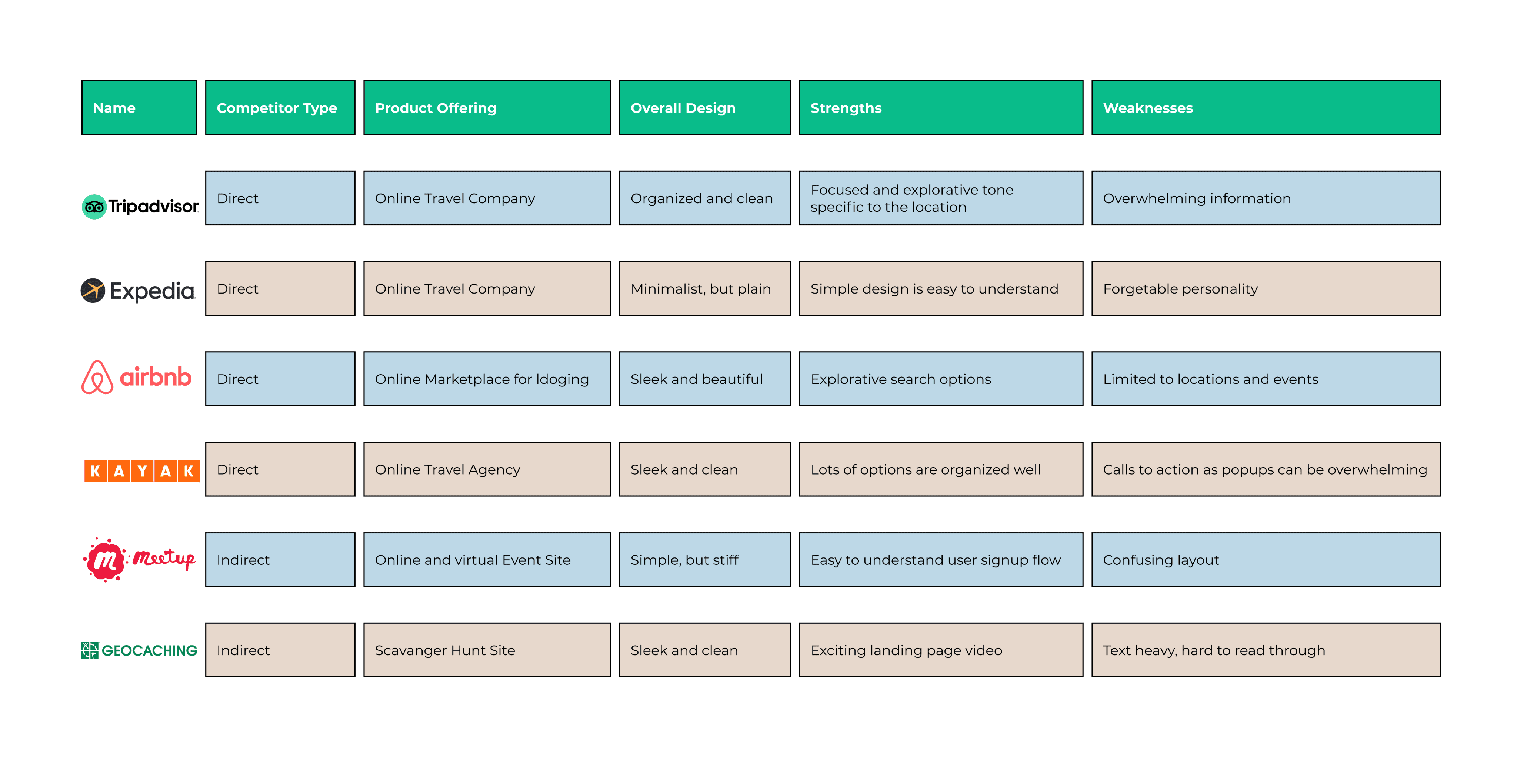
For the competitive audit, we identified direct and indirect businesses with applications including Tripadvisor, AirBnB, and Kayak. During this analysis we categorized by competitor type, overall design, strengths, and weaknesses. Through this analysis, we built an idea for what the baseline expectations would be for a travel app, as well as a gap in consistent, event focused design.
Baseline Expectations:
Simple, easy to understand navigation
Focus on explorative search options
Market Gaps:
Strong personality in design
Too much information can easily overwhelm someone
Lack of focus on smaller local events
Wander Competitive Audit Findings
User Interviews
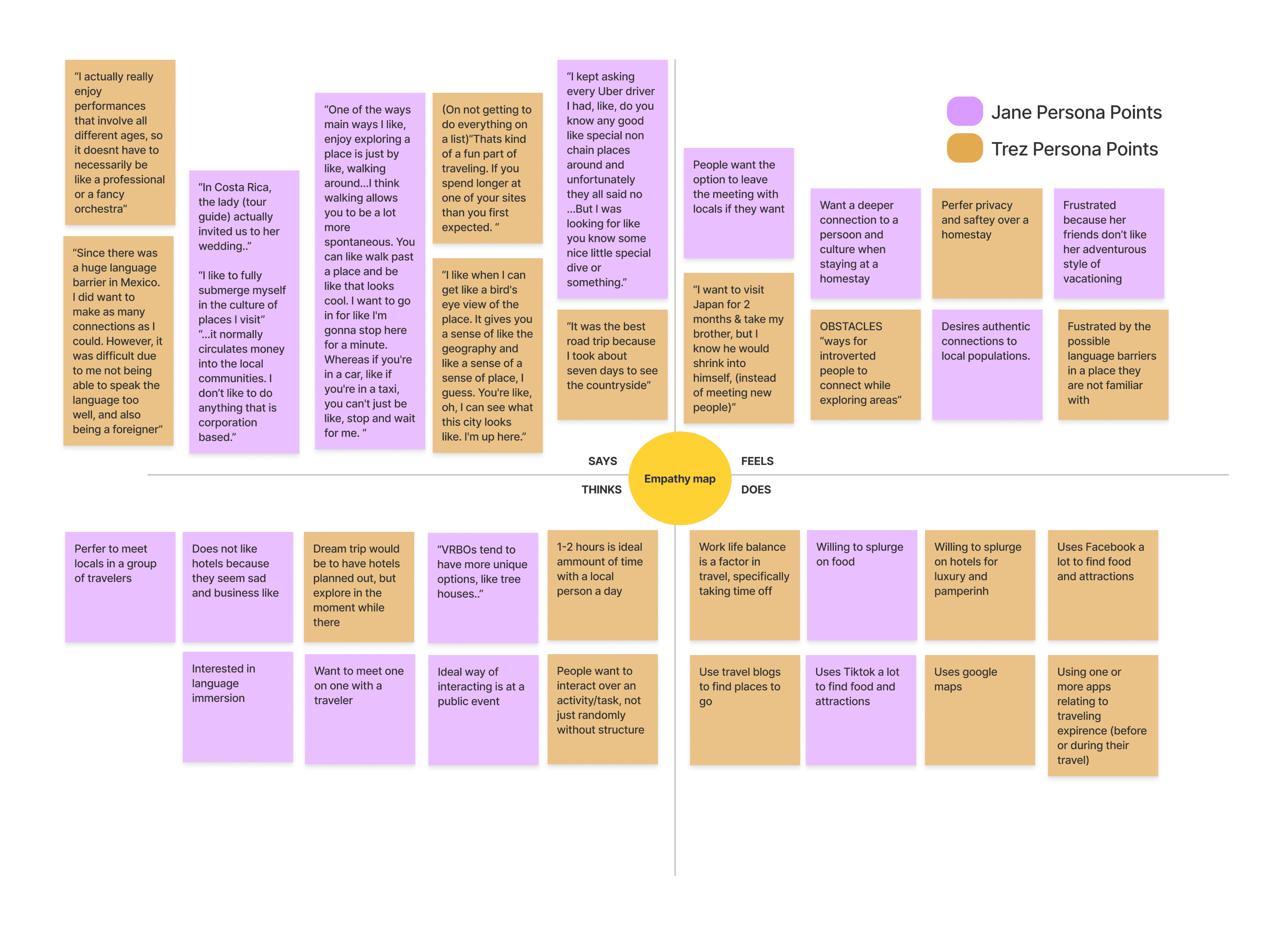
From these 5 interviews, we copied stand out quotes and notes into a miro board, and organized each note into an empathy map to start building out our user persona.
Our Miro board after the card sort, with come cards in between groups to represent overlapping information for our 2 user types.
Through the quotes, we gained a deeper understanding into the kinds of local attractions and activities our interviewees were interested in. Our Interviewees all mentioned in some way a preference to feel like a local, and seek hidden gems that would align with that experience at their destination.
A fear of ours before the interviews was a low interest in adoption due to travel apps that were already available. However, while looking through takeaways, we noticed an interesting pattern in our empathy map.
Ideal way of interacting is a public event
Use facebook or Tiktok to find attractions
Use one or more apps related to traveling experience before or during their travel.
Based on these habits, we learned that travelers already used apps to seek more local attractions, were interested in local public events, and could be open to adopting our app along with any other traveling apps to enhance their experience.
A goal in our app was to make sure that it could work seamlessly with any other tech a traveler would be using to make their plans easier to make, and give more time to focus on being in their destination.
Quantitative Survey
To validate our findings in the user interviews, we also conducted an online survey through Google Forms that would dig deeper into some of the lingering questions and solidify our findings.
Our survey included a filtering question to make sure our sample size only included travelers who have traveled at least once in the last year, then focused on specific travel habits like how they find events, preferred activities, and any apps they already use to plan travel.
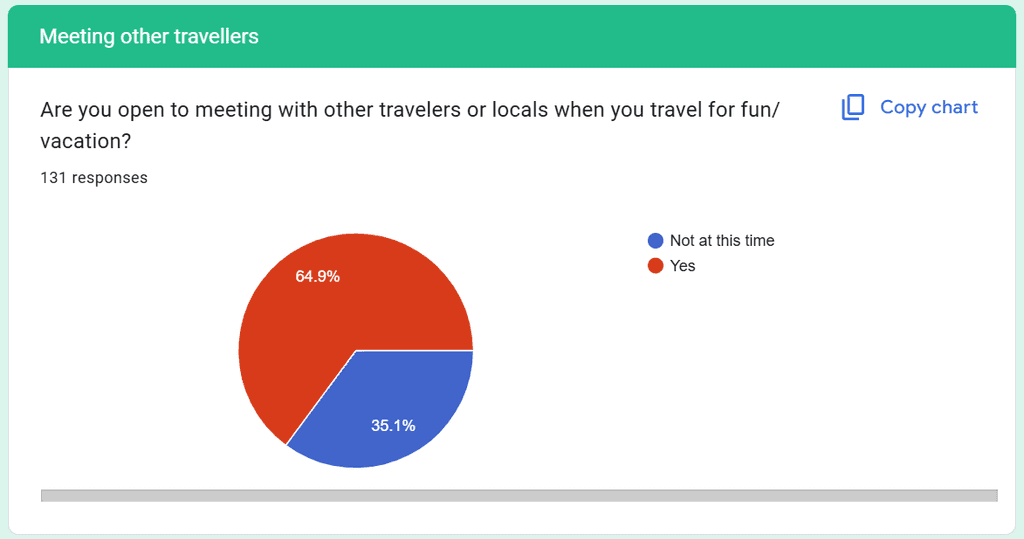
Our survey got 178 responses total, with 131 responses making it past the filter question.
64.9% of responses would be interested in meeting with other travelers on vacation.
Key take aways:
64.9% were open to meeting other travelers or locals while on vacation.
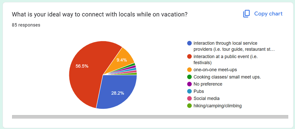
56.5% of participants said their ideal way to connect with locals while on vacation was through public events, and 28.2% said their ideal way was through a more structured service such as a tour guide or restaurant staff.
The top kind of local entertainment that people seek out at a vacation destination is food with 100% checking food among 5 activities.
People primarily prefered to meet locals through services like tour guides and restaurants
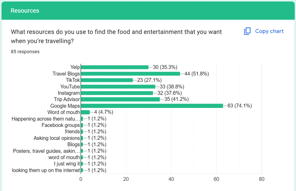
We collected information on apps that people already used to plan their travel experience
For app adoption, we were able to solidify our findings further with a list of resources users already used to find food and entertainment while traveling. The top 3 resources being Google Maps, Travel Blogs, and Trip Advisor.
Through our survey and interviews, we discovered pain points specifically around finding trustworthy and authentic recommendations. We got more insight into the main goals of a person on a trip, which focused more on experiences rather than destinations than our team had expected.
Analyzing the survey findings, the majority of answers said that they would prefer meeting people while engaging in an activity or task, like a festival or getting lunch. This, along with a majority of responses saying that they would prefer to meet in groups rather than one on one. This lead our team to realize we would need a robust filtering system for events.
Phase Summary
🌼Discovered distinction between two different user personas
🌼Used research findings to build user personas
🌼Developed mission statement
User Persona
We noticed in our interviews that some of our interviewees were more extroverted or introverted than each other. In our Survey, our question on if someone one consider staying with a local while on vacation, the responses were divided down the middle with 50.6% Saying no, and 49.4% saying yes. For the responses that said no, 81% said that privacy was a main factor in their decision not to stay with a local. Based on these findings, we were starting to see a divide between travelers interests.
Of the people that said no to staying at a homestay, he primary reason was a desire for privacy
Because of this divide we decided to create two persona’s to cater to. One persona would be more social and outgoing while the other would be more introverted. Our goal was to be able to cater to both people's needs by providing a wide array of ways to find destinations, and assess a user's interests to recommend the destination that would suit them the best.
Adventurous Jane
Age: 22
Occupation: Waitress
Location: Houston, Texas
Bio
Got into traveling after watching Tiktok influencers who travel on a budget. Likes adventurous experiences, but needs to plan to stay in budget.
Interests
-Trying Local Food
-Building community with locals
-Immersive cultural learning
-Learning New Languages
Motivations
-Wants to go on crazy adventures
-Traveling for as cheap as possible
Pain Points/Frustrations
-Lack of money prevents Jane from traveling
-Unable to make friends who love adventuring as much as her
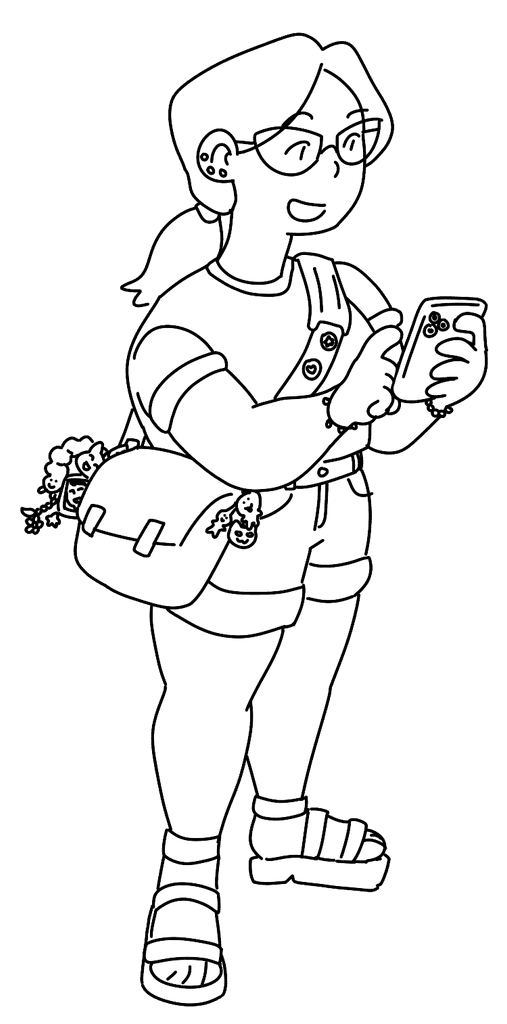
Adventurous Jane represented the more outgoing persona, who would focus more on exploring on a budget and seeking social activities.
Trez represented a more introverted traveler, but was no less curious! To reflect our uses that listed taking time off of work to travel, Trez prefers to have amenities that allow him to travel while working remotely. While not as interested in social events, Trez is a foodie, and loves finding new taste experiences.
Globetrotting Trez
Age: 28
Occupation: Cyber Security Analyst
Location: Phoenix, Arizona
Bio
Lives to travel. Because he works remotely, he values convenience, efficiency, and safety so he can work from hotels and cafes, then spend the rest of his time exploring.
Interests
-Food is #1!
-Stable internet connection
-His own space to relax
Motivations
-Bored when he stays in one place too long
-Wants convenience to maintain working remotely
Pain Points/Frustrations
-Very busy when traveling since he works at the destinations
-Gets burned out at social activities
Mission Statement
Through collaborative mind mapping, we determined that our main focus would be on forming connections for travelers. While discussing project ideas, our group realized that we all had a nostalgia for travel after 3 years of Covid-19 restrictions. Tapping into that feeling and desire for more intimate travel experiences, we decided to work on a travel app that would help users find local and unique experiences when traveling nationally in the United States.
Using the quotes, pain-points, and interests gathered from our qualitative and quantitative research, we summarized our project into our mission statement.
Phase Summary
🌼Brainstormed Low-Fidelity Wireframes for user profile and messages mobile screens
🌼Applied branding standards to build Hi-Fidelity wireframes for the search results filter, user profile, messages, and payment flow
🌼Collaborated with another designer to create the desktop view for the search results screen
Wirefames
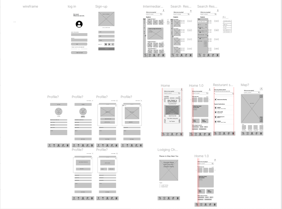
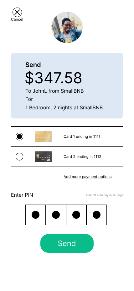
For our MVP, we decided to primarily focus on pages that would be vital to the user flow of finding and event, contacting and event host, and paying a transaction. We went through a brainstorming session creating wireframe options for screens that would be related to this user flow.
Our initial wireframes planning the event search flow
Hi-Fidelity Wireframes
We knew from our research that a simple and sleek design would be the standard that we needed to achieve before focusing on our unique features. This included round corners and vibrant colors from our main company branding.
I was primarily in charge of the Explore, Filter, and direct messaging screens as we transitioned into hi-fidelity designs.
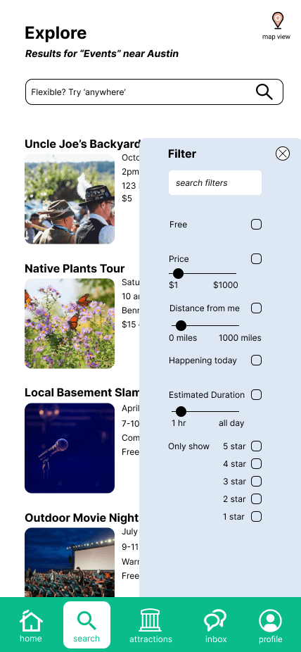
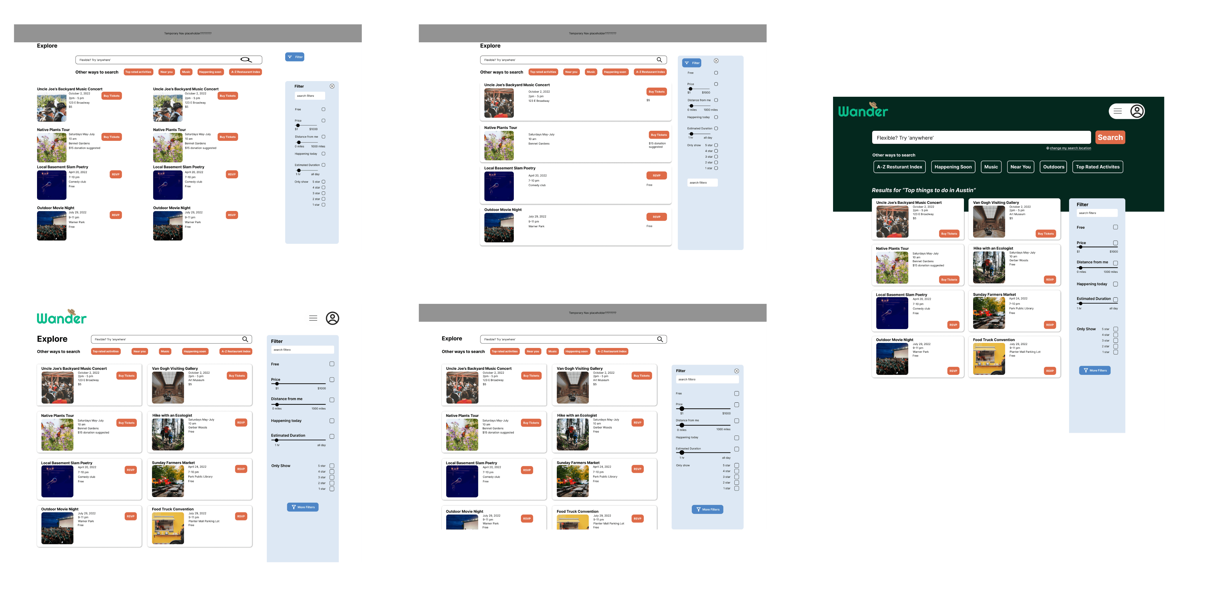
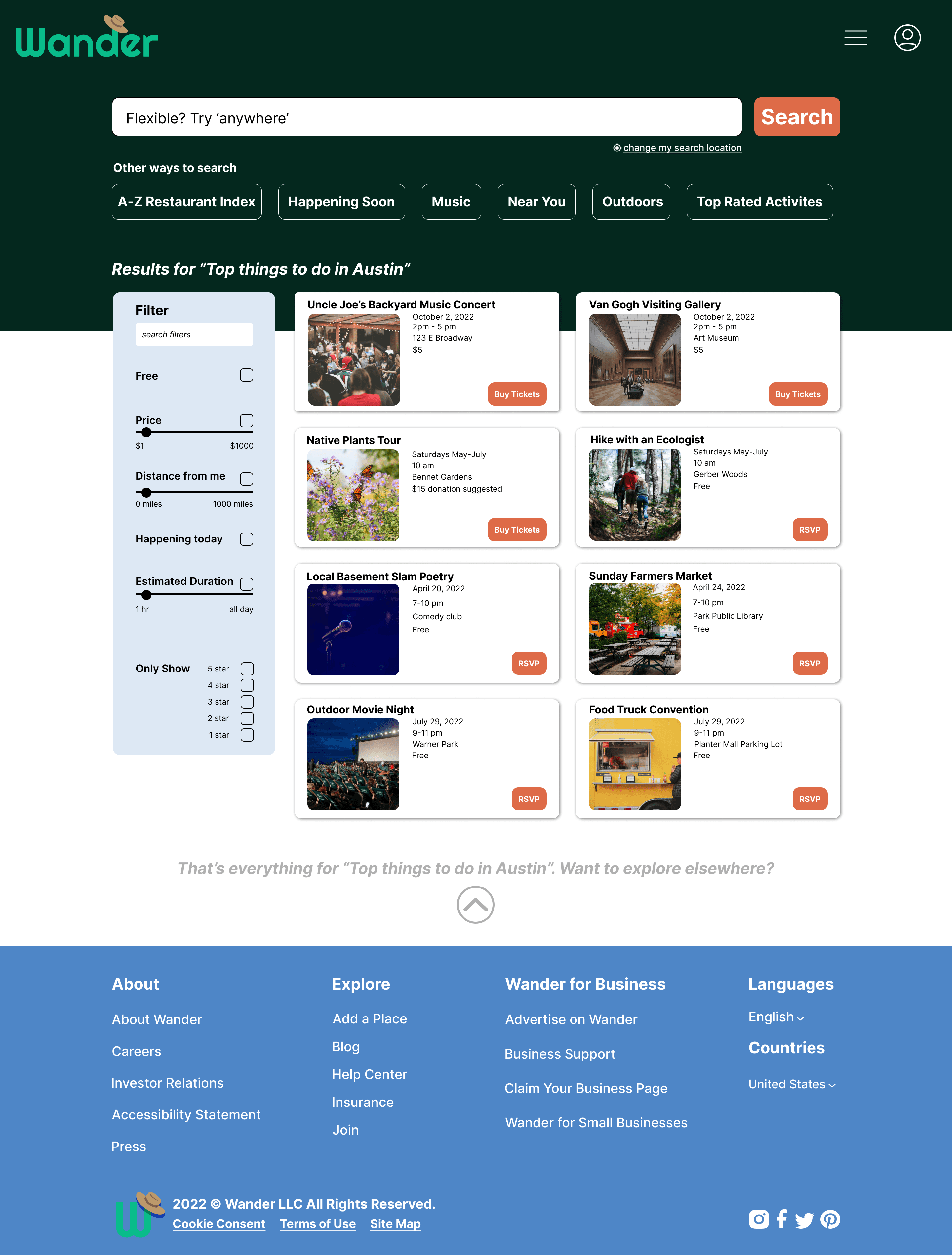
I used research from our competitors to translate the filter criteria into an organized hierarchy involving price, location, time and star rating of events.
The Hi-Fidelity Wireframes that I was in charge of finalizing
For the direct messaging, I tried to use shape to differentiate the speech bubbles authors, and wanted to include invoice information so that event hosts and users would be able to see and reference event information, as well as easily send and confirm invoices without having to switch to a different screen. That way, the event info and invoice would be included in the conversation.
My team gave collaborative feedback on each others designs as we implemented color, images, and branding elements. Through the feedback, I was able to incorporate the suggestion to keep the filter options bar on the left side instead of the right to align with user expectations on other sites. As well, I was give the suggestion to differentiate the messaging bubbles in the chat, and used color and shape to differentiate the speech bubbles origin, as well as specific actions such as a transition between users.
Variations of the desktop search screen mock ups
A Hi-Fidelity Mockup of the desktop search page
Phase Summary
🌼Mapped navigation between the search and filter screens
🌼Used Figma to connect interactive elements for the search, user profile, messages, and payment flow
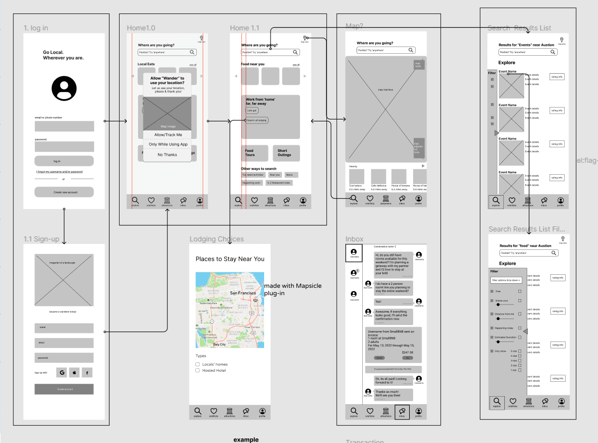
Once we decided on the wireframes that communicated the screen's purpose best, we added more tangible detail and planned the interactions on how a user would navigate between screens.
A screenshot of our low fidelity wireframes and arrows to keep track of navigation flow
We knew from our research that a simple and sleek design would be the standard that we needed to achieve before focusing on our unique features. This included round corners and vibrant colors from our main company branding.
All of the finished Hi-Fidelity wireframes connected in Figma
Phase Summary
🌼Assisted in setting usability criteria and creating usability testing questions
🌼Conducted a usability test through screenshare with a participant
🌼Created A/B testing visuals and questions
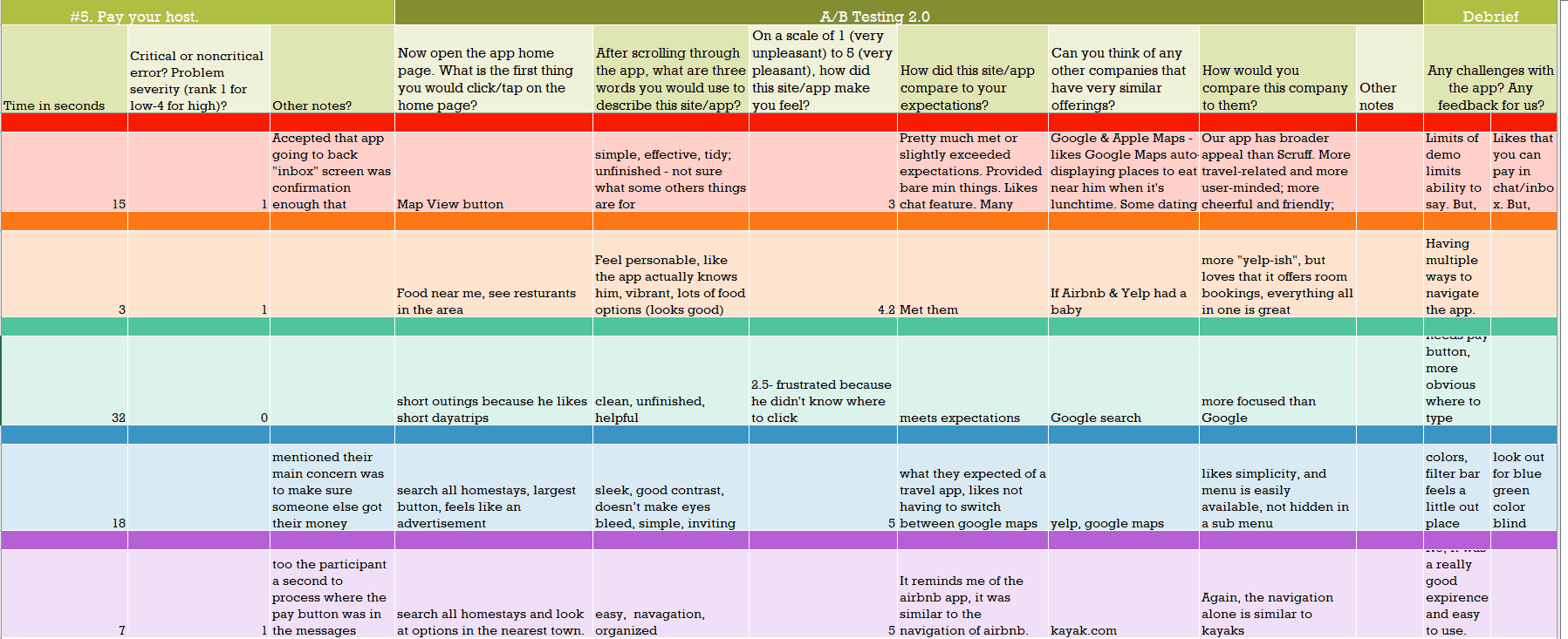
For validation, we conducted usability tests in a similar manor to what we did in interviews. Each of us conducted a usability test and we shared our questions and tasks within an excel sheet. The usability tests were conducted virtually, with the tester sharing their screen and speaking aloud as they navigated through the shared Figma prototype.
The main focus of the usability test was to validate the ease of use for our user flow, as well as gage the adoption of the app for future rips that testers would have.
Excel sheet used to keep track of the usability tests notes and observations
During usability testing, we also planned to perform an A/B testing for our homescreen. However, our method of implementation was to have each user see one screen and give their opinion, but never see the other screen. Due to this misunderstanding, we were unable to use the feedback for a comparison between the two.
The moment we realized this was during a presentation of our usability testing results. My heart sank into my stomach. What felt like a successful round of testing ended up having unusable data.
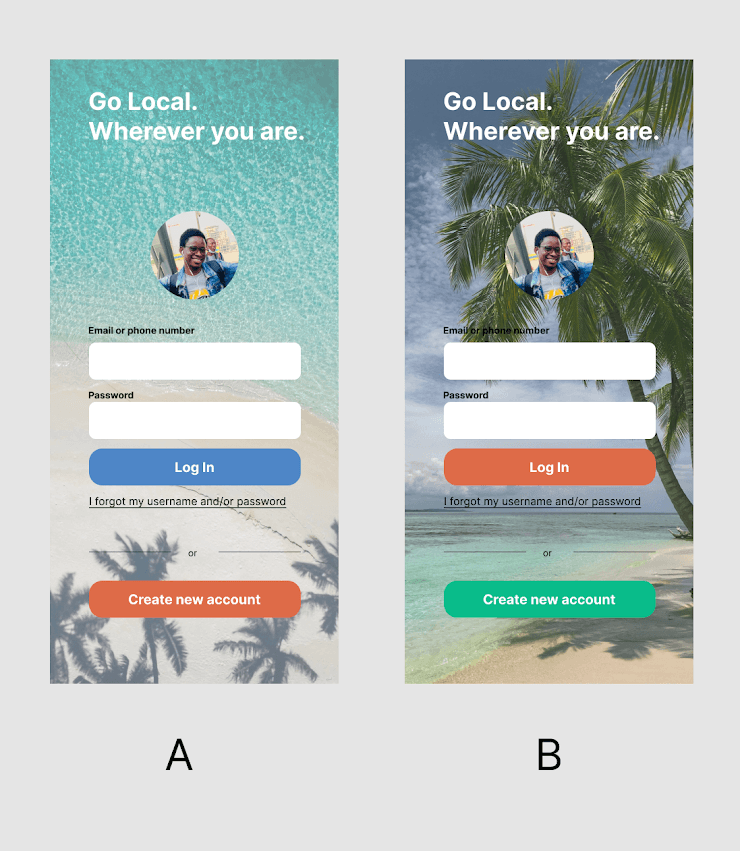
However, at the suggestion of our instructor, we were able to request the other cohorts in our group participate in a proper form of the A/B testing. I placed the two home screens side by side in an image, and worked with my team to convert our A/B testing questions from our usability testing script into a multiple choice survey format. Through teamwork and the aid of our other cohort members, we were still able to gather proper comparison data on the login screens that lead to the decision to use option A.
The side by side comparison I put together for the A/B testing survey
Through this feedback and the Usability tests, we were able to update our fireframes to reflect the prefered login design.
Conclusion
Working on this project taught me about communicating on a team and working on a design project from ideation to validation. Using Miro for brainstorming and Figma for design was both a great way to improve my technical skills and get to collaborate with my fellow designers.
I'm proud of this as a capstone project, and excited to take what I learned with my as I explore more design projects in the future.
Things I would do next time
In the future, I would want to explore a third user type of an event host, and the process of a local vendor creating and marketing their event that would be the lifeblood of the app. While Trez and Jane’s experience is the main focus, a vendor’s ability to set up and manage events will be pivotal to everyone’s enjoyment.
I would also want to explore the process of how events and locations are added to the application and vetted for an improved experience for both our event hosts and traveler users.
