Lucemyra Site Redesign
Finding a balance between user and business needs and provide user specific information to both patients and health care providers about medication to lessen the symptoms of opioid withdrawal
Project Summary
Project Duration: 5 Months
Role: UX/UI Designer and QA Tester
Team: 2 Designers, myself and Lead Designer for guidance, 1 PM, 1 Dev
Client: US WorldMeds
Introduction
The healthcare system is a complicated landscape to navigate for both healthcare specialists and people who are seeking care themselves. We’ve all been there trying to read though the safety instructions of a medication and it shows how important user centered design is for making sure that the people who are seeking help are able to find it, understand it, and have access to it.
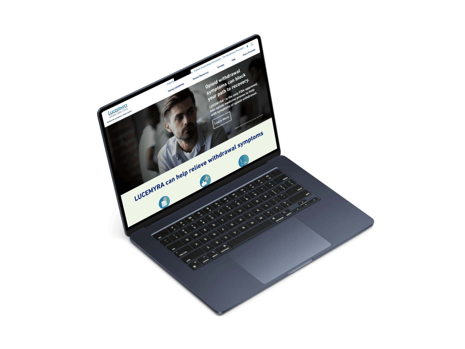
In 2023, I was brought on by Interapt as a UX Designer to redesign USWorldMeds site for their product Lucemyra, a medication that lessens the symptoms for patients experiencing opioid withdrawal. Most of the projects that I worked on in my career before this redesign were targeted toward specialists with a deep understanding of the subject of our product. Redesigning a site with patients as a primary audience was a new and refreshing task.
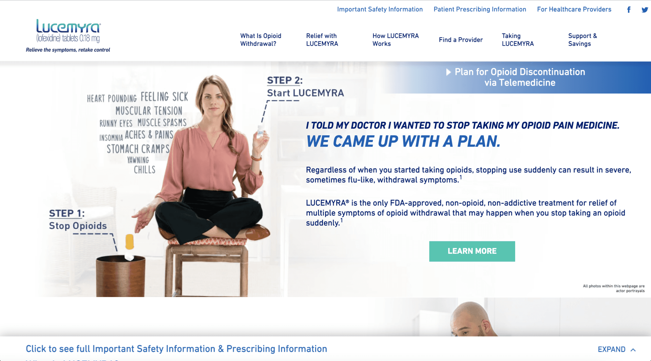
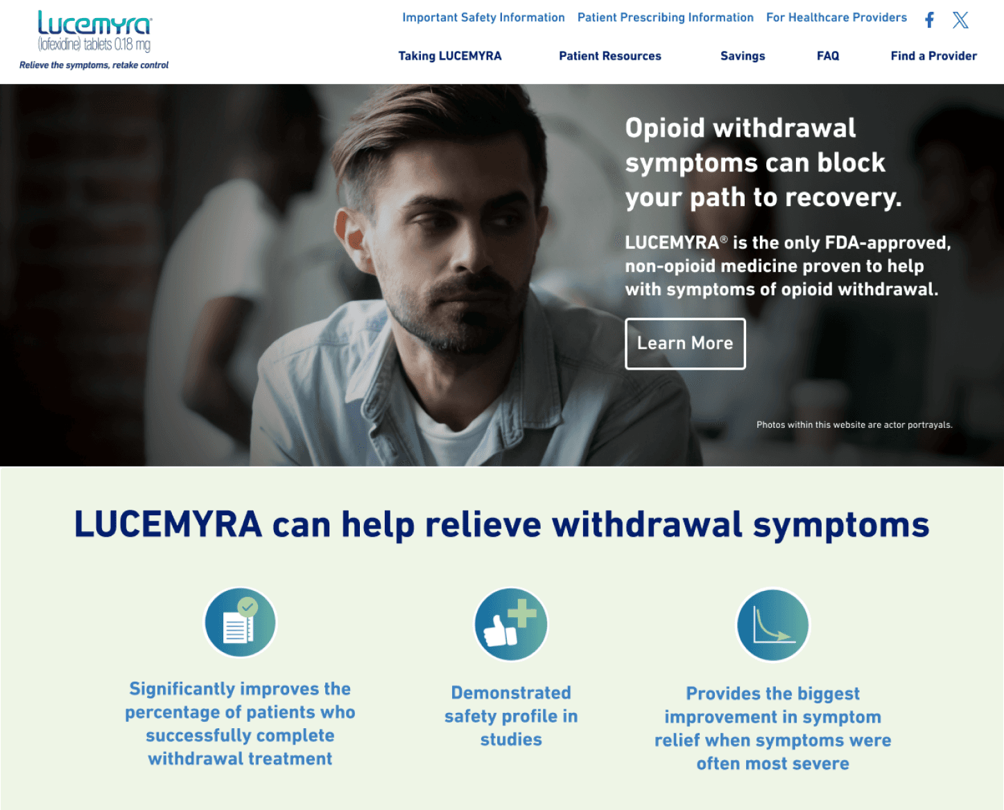
A screenshot of the Lucemyra homepage in 2023 before the redesign
Phase Summary
🌼Led discovery in kickoff meeting
🌼Set project expectations with stakeholders
🌼Confirmed stakeholder goals for the project
🌼Collected and analyzed relevant documents related to the updated branding and messaging
To kickoff the project, we began discovery by meeting with the products owners at USWorldMeds. I was supported by my project manager and lead UX designer who provided guidance and feedback on my decisions throughout the project. During the kickoff meeting, we discussed the scope of the project, expectations, and collected relevant documents from our stakeholders.
Through these conversations, we learned that the primary problem with the current site is that USWorldMeds had updated a lot of the branding and messaging for Lucemyra that was not reflected in the site. Additionally, USWorldmeds wanted to improve on their SEO rankings and accessibility compliance.
Documentation and organization became vital in the discovery phase due to the branding documents that USWorldMeds shared were driving factors in the redesign. After collecting the documents, I confirmed with USWorldMeds on our main problem statement:
Once the goal was confirmed with USWorldMeds, we moved into research to find the best way to approach the site redesign.
Phase Summary
🌼Documented the current state of the site
🌼Lead a card sorting workshop to identify changes to the information architecture
🌼Discovered and discussed the two separate users
🌼Conducted an accessibility audit on the current site
Research
While we were not able to conduct direct user research due to the time constraints of the redesign, we were able to gain a collection of feedback from USWorldMeds customer support team that showed the most frequent feedback for the current site was difficulty in navigation and finding information. Assessing the information architecture became a point of interest based on this feedback.
Documentation
Before jumping into the redesign, I went on a screenshot spree documenting the current site content, interactions, and pages. The site itself was small enough to do this manually, and let me get an in depth look at the current site. I was then able to compare information to the updated branding materials that were sent and identify discrepancies and areas of interest, while also flagging any standout areas of improvement for accessibility and navigation.
This process helped me gain an in depth understanding of the current site, as well as provided a great visualization resource for other research activities.
Information Architecture
Going through the site, I came away with two observations about the information hierarchy and navigation:
Updated content will remove whole pages
Current navigation uses a lot of menu drop downs to get to specific information
Based on these findings, I decided that adopting a flat hierarchy for the navigation could help the site, but needed a way to confirm the new content. To do this, I set up an open card sorting activity to determine a more simple site navigation.
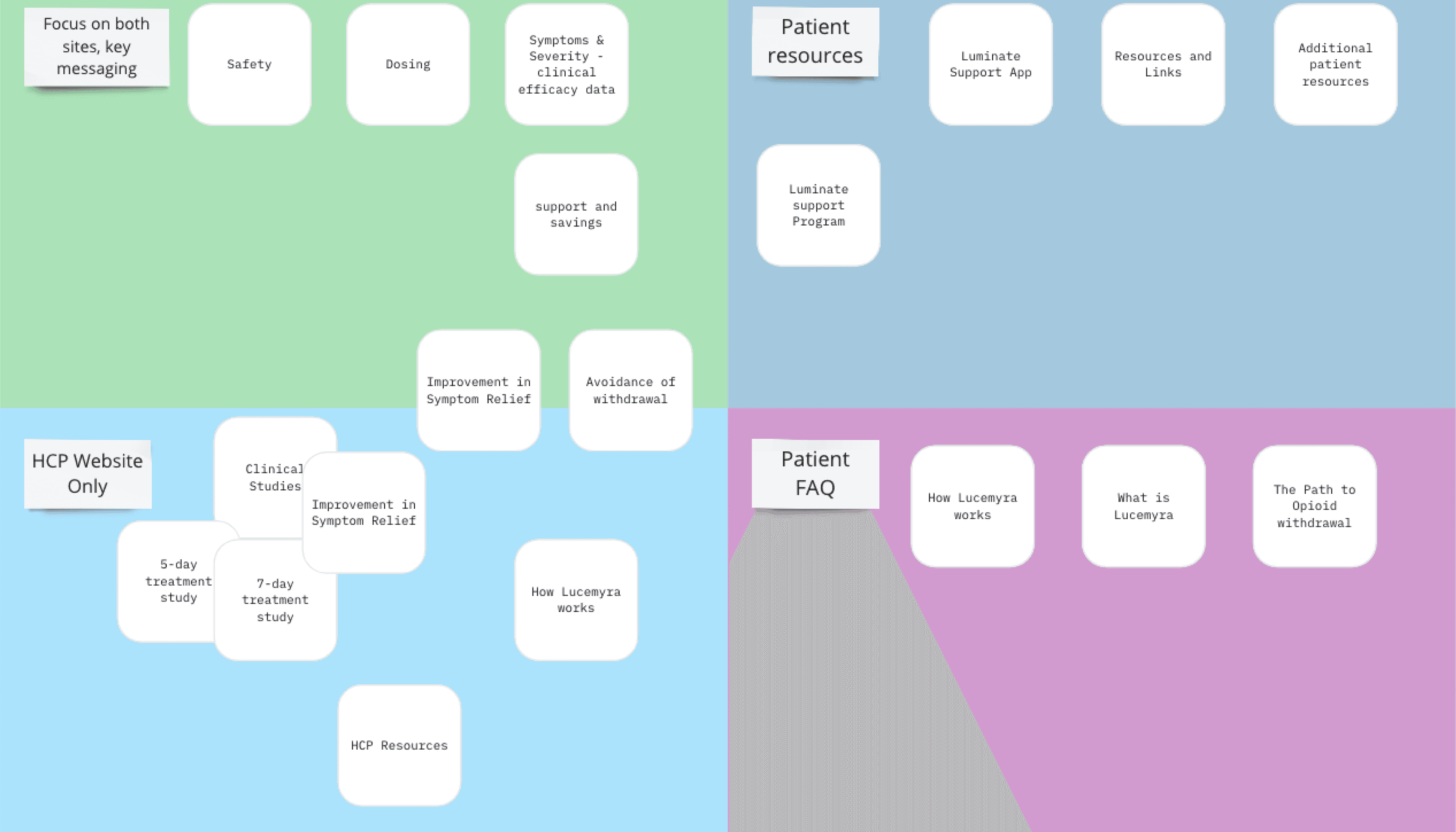
I organized the current pages of the site and extracted the main topic of each page. Then those topics were placed on cards in a random order in a Miro board for the card sort. The card sort would be conducted by our product owners at USWorldMeds. While actual users would have been more ideal, the product owners are experts in the subject and could use their background knowledge to categorize the page topics.
Through the card sort, we were able to:
Identify which pages would be deleted for irrelevant content
Combined topics into new pages with thematically relevant content
Identified a new type of User that I was not previously aware of, a Healthcare Provider(HCP)
Our Miro board after the card sort, with come cards in between groups to represent overlapping information for our 2 user types.
After the activity, we took the time to discuss deeper the distinctions between the two user types, their differing interests and needs, and finally decided that the site would have distinct versions with custom messaging between the two users. We were able to use the categories to identify topics that would interest patients, topics that would interest HCPs, and topics that would overlap between the two users.
First Primary User: Patient
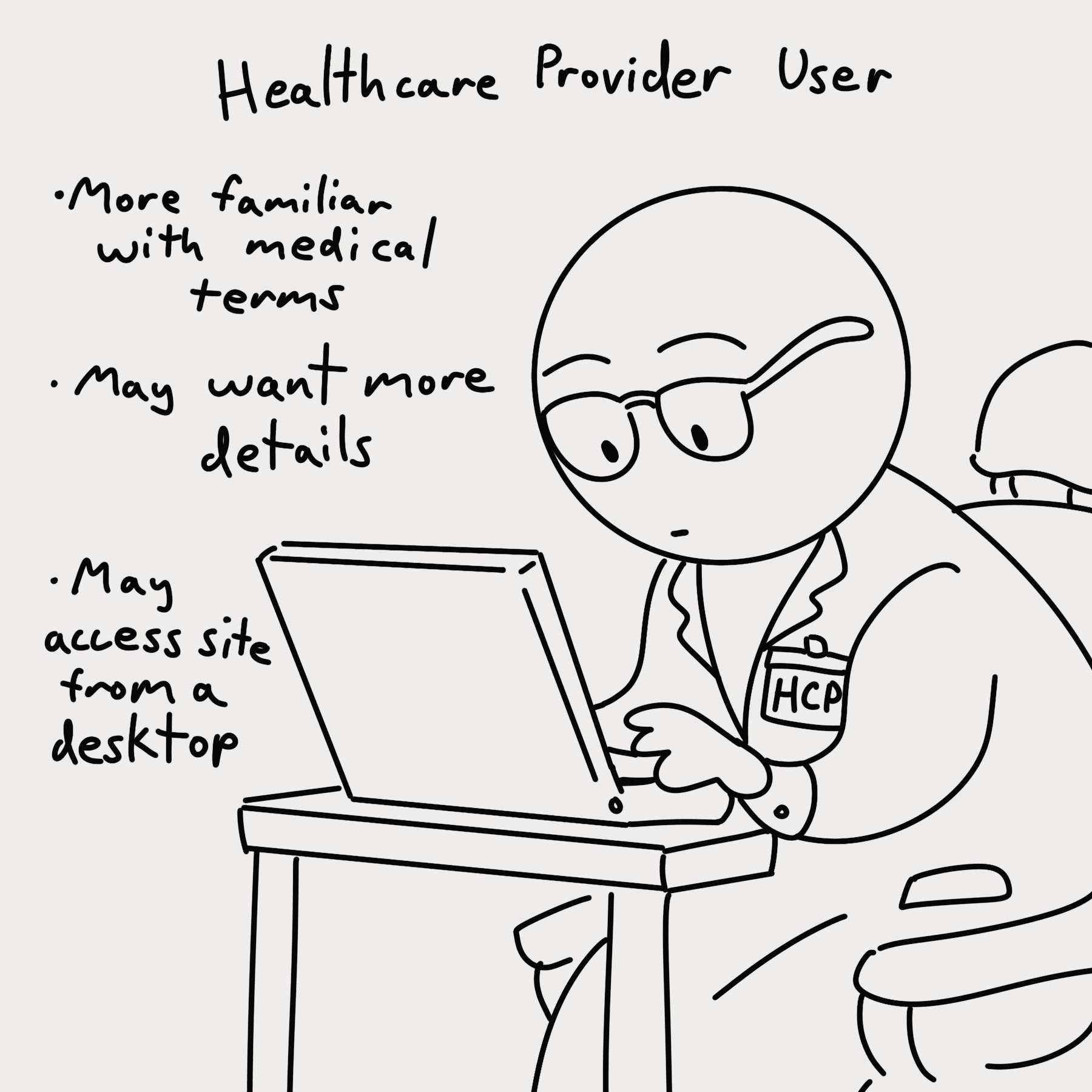
Second Primary User: Health Care Provdier (HCP)
Accessibility Audit
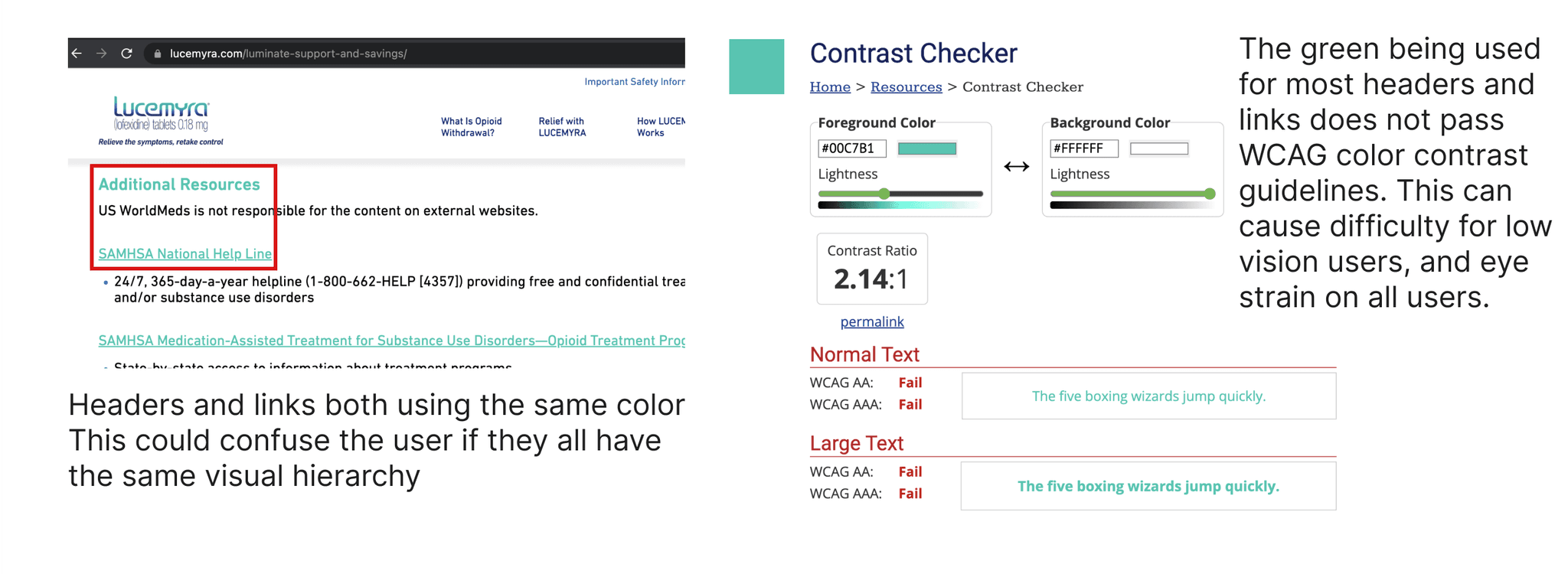
A Slide of the Accessibility Audit Shareout, showing screenshots of the Links and Headers using the same color close together
A slide of the accessibility audit share out, showing screenshots of the images missing alt text, and suggestions of how to incorporate them into graphics for the updated branding
A slide of the accessibility audit share out, showing screenshots of the links and Hheaders using the same color close together
A Slide of the accessibility audit share out, showing screenshots of the hover states and suggested solutions
A major goal of the website redesign was to improve the overall accessibility of the site. I used an excel tracker template to document whether the site passed guidelines at A, AA, and AAA levels. Going through the documentation, I found that the current site met almost all of the first level standards, and a few of the second level standards. Based on this, I knew that the redesign should maintain any of the standards that were met, and focus on reaching the standards were not.
With the goal of meeting the first and second level standards, I went through the screenshot documentation to highlight these instances as a visual reference. To communicate these design decisions, I used the screenshots to show each instance, as well as provide recommendations on how the redesign can be utilized to meet those compliance levels.
The Accessibility audit Excel Template Filled out
One compliance issue was color contrast. Many of the buttons and links used text colors that were similar and caused eyestrain. Headers and links also used the same text color, leading to an unbalanced information hierarchy. Knowing this, I went through the updated marketing documents and tested each of the colors used for color contrast that met with compliance.
During the accessibility audit share out, I was able to communicate these instances on the site with the screenshots, and gather feedback from USWorldMeds about their thoughts on the recommended changes and align on the right direction.
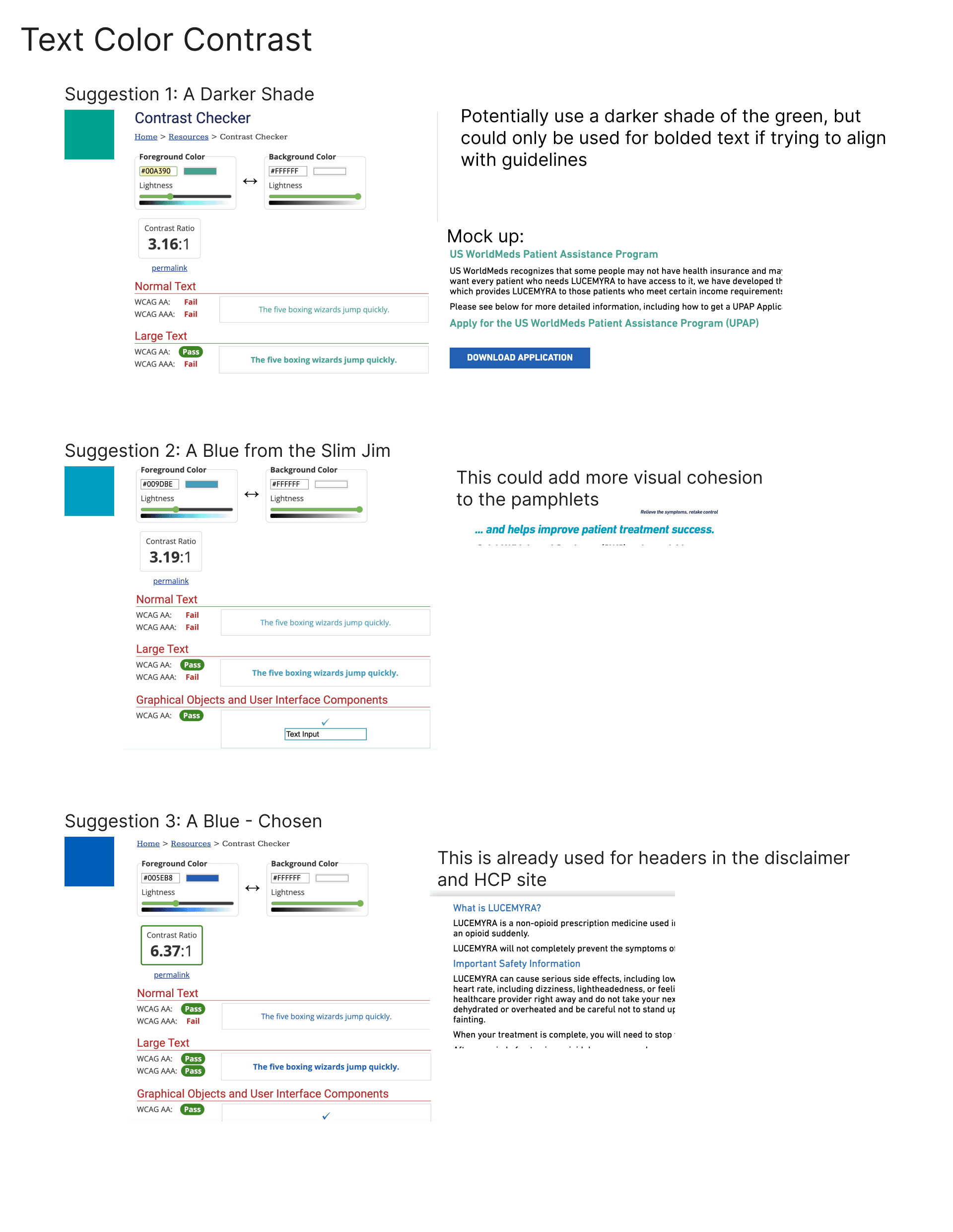
After finding several swatches that fit our needs, I made quick mockups of how the color would be used on the site in headings and links, and presented the options to USWorldMeds. We were able to use the updated marketing materials to meet standards and create a stronger visual hierarchy.



Notes:
Using annotated screenshots allowed us to stay on the same page through the accessibility share out
I also wrote an article going deeper into the accessibility audit process on Medium.
Read the article here!
A Slide of the Accessibility Audit Shareout, showing color options that meet minimum AA requirements
Phase Summary
🌼Targeted accessibility standards that were not met in the accessibility audit
🌼Made wireframes in Figma for both the Patient and HCP sites
🌼Incorporated updates branding materials to align the imagery and graphics to new standards
🌼Regularly shared progress updates with stakeholders to ensure that the designs were meeting expectations and accurate to the updated info
Design Process
With our foundations set and goals aligned, I began to work on the redesign pages. We decided to work on the Patient Site design first, and once the design was approved, we would proceed further with the HCP site design. I still kept in mind the content that would be featured on both sites so that there would be a visual relationship between the two while still using some distinct visual elements to signal to the user the change in content in case they crossed over to the other site.
For inspiration, I looked to other medical related sites to get a sense of the overall standard practices, as well as other USWorldMed site designs to align with their overall visual tone. After reviewing the sites for Humana, Lively, and another USWorldMed Product, ZIMHI. A pattern emerged of clean, sleek, and simple designs, I began organizing the updated content and working on the first draft of designs.
Main goals for the designs
Simple and sleek look to align with industry standard
Use color highlights and overlapping elements to emphasize important information
Visually align with the updated branding documents to create a cohesive look between physical and digital information sources
Solidify overall design look and tone for the Patient site first, then use the system for the foundation of the HCP site
Patient Site
Hierarchy
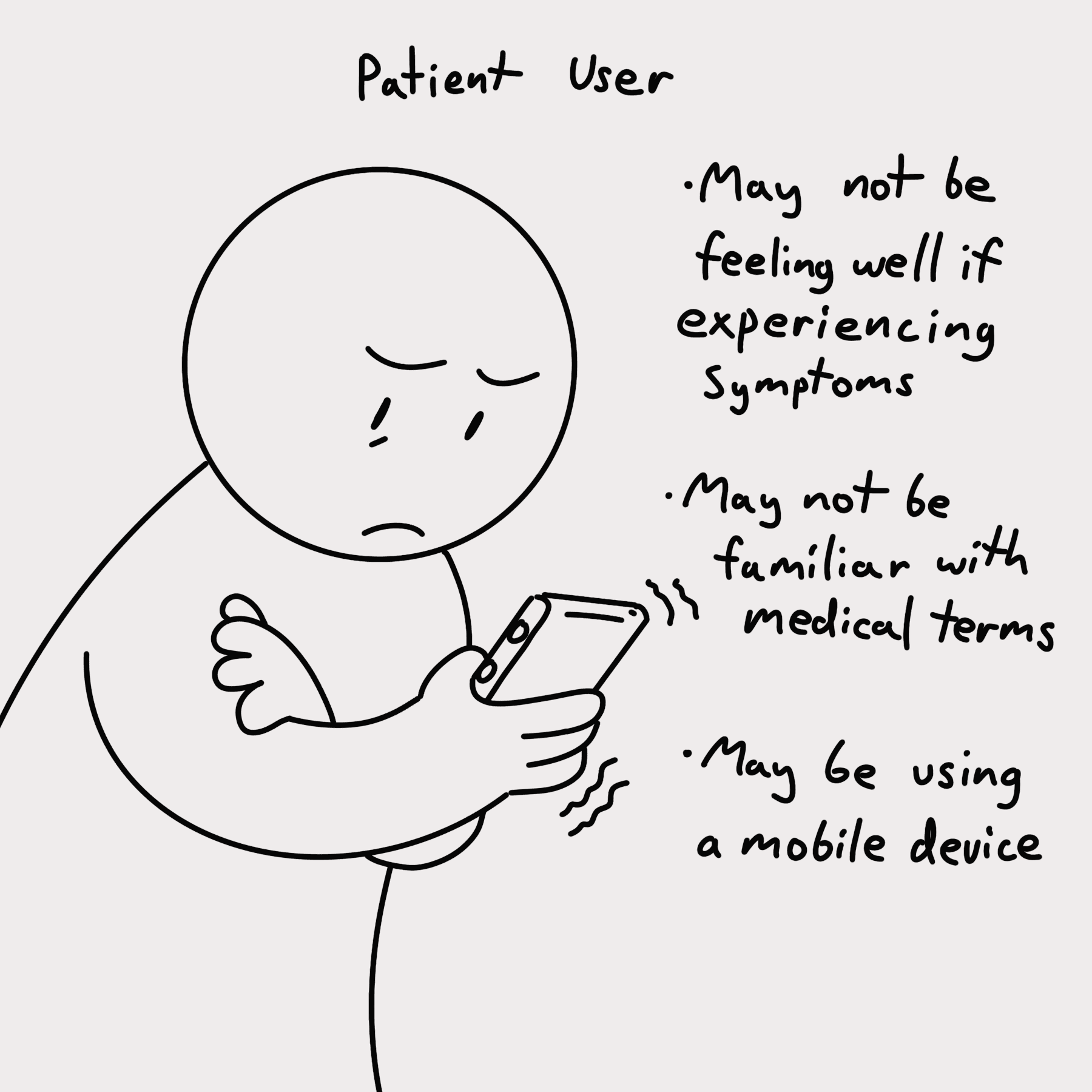
User: Patient

May not be feeling very well while accessing the site
Navigation needs to be simple to they can find helpful information easily and quickly
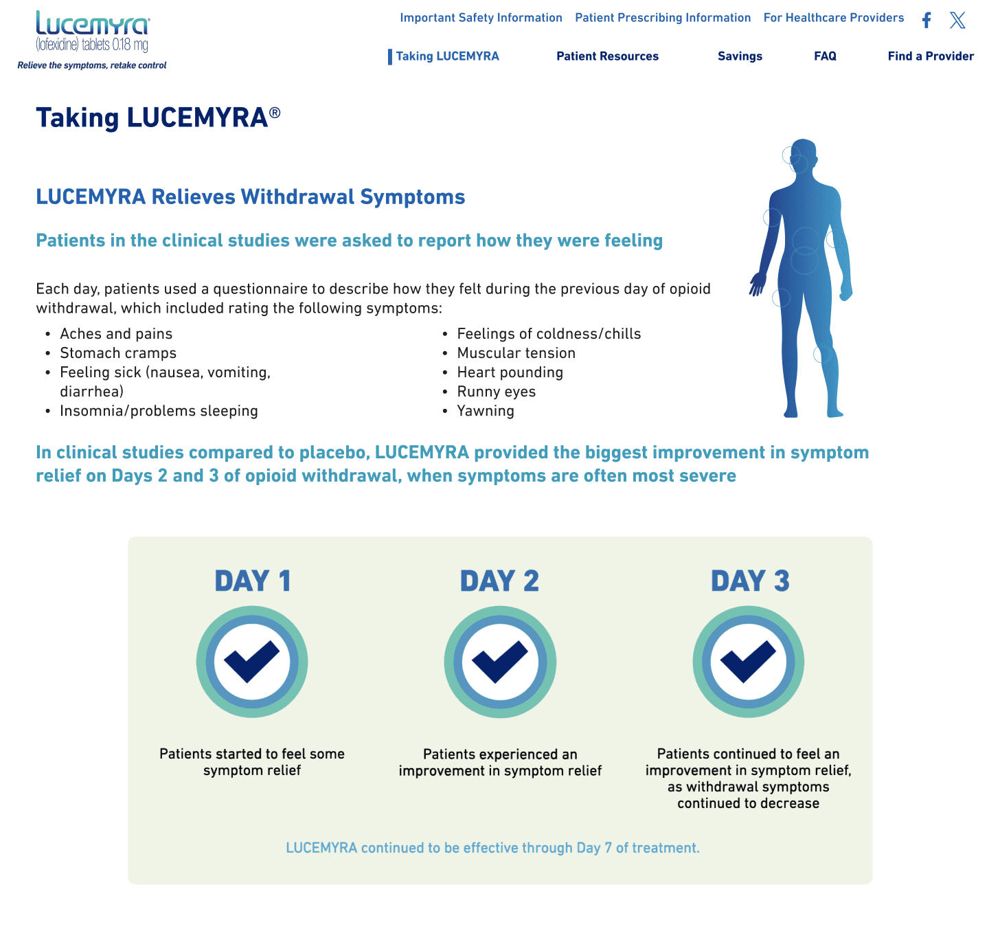
Building on our improved navigation and visual hierarchy, we needed to make sure that the information on the patient site was easy to navigate and understand. The pages were ordered in a way where the highest priority pages, “Taking Lucemyra” and “Find a Provider”, are on the opposite ends to be easily scannable. As well the updated text styling was used to ensure that content of the pages is organized and easily scannable for a patient to jump to the info that theyre looking for.
Taking Lucemyra page, with immediately going into opioid withdrawal symptoms and Lucemyra expected timeline of symptoms
Responsive Design
User: Patient

May be accessing from a mobile phone
The site should be responsive and easy to read and navigate at any screensize
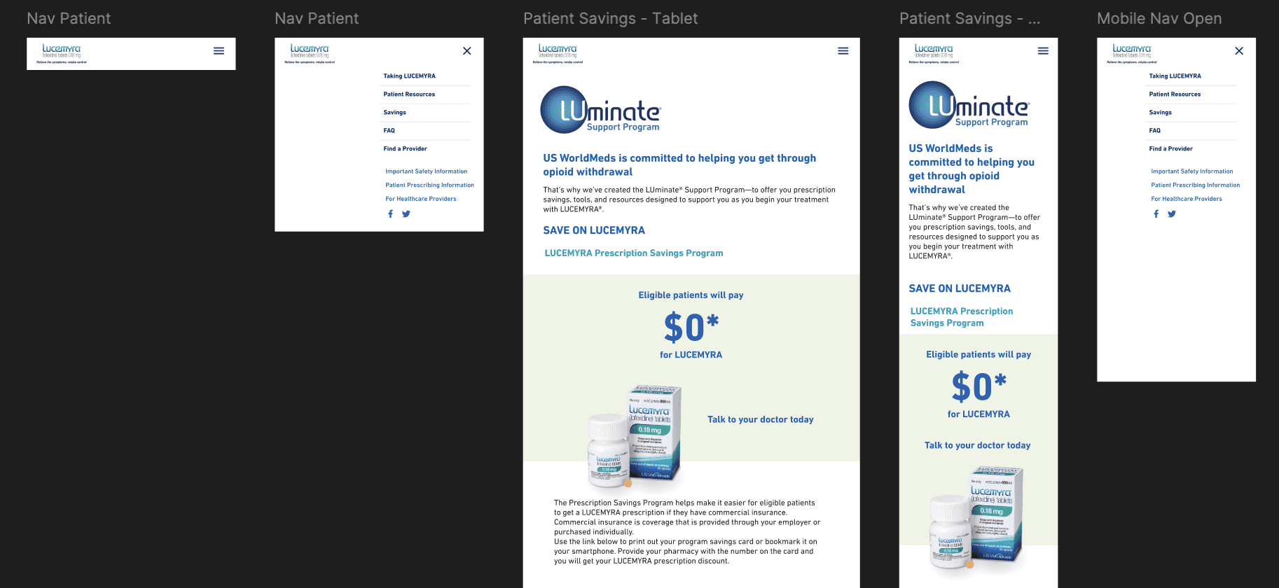
Because patients might be looking for information on their phone in a provider’s office or elsewhere, we made sure to prioritize responsive design early on. For the page designs, I divided the content into sections that would break up information as well as be able to easily reorganize as our content hierarchy was finalized. This also helped to easily translate each section into stackable grid pieces that the developer could organize to fit into different scree sizes.
Frames of the Patient Savings page and Navigation at different mobile screen sizes in Figma
Images and Story
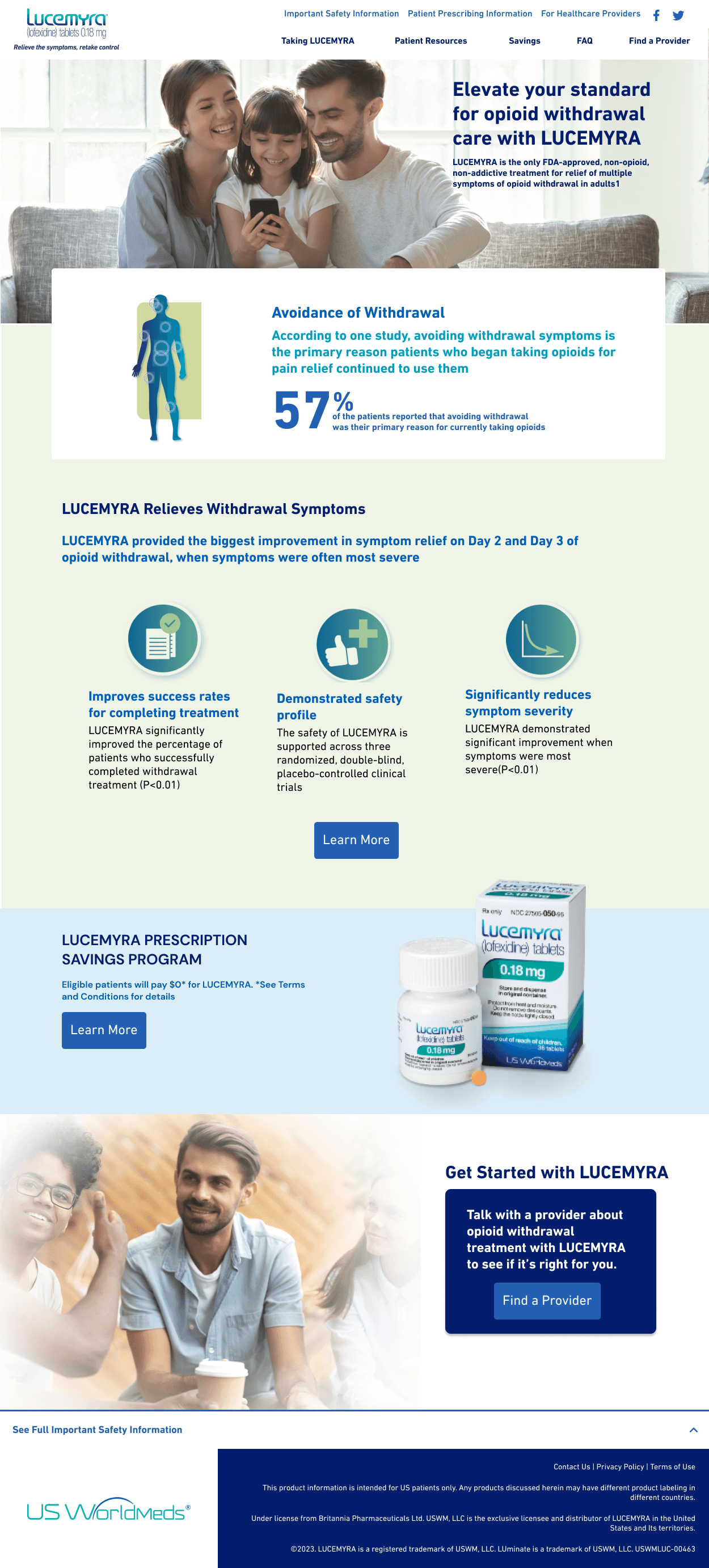
An early landing page design with positive images throughout
(Footer)
(Intro summary)
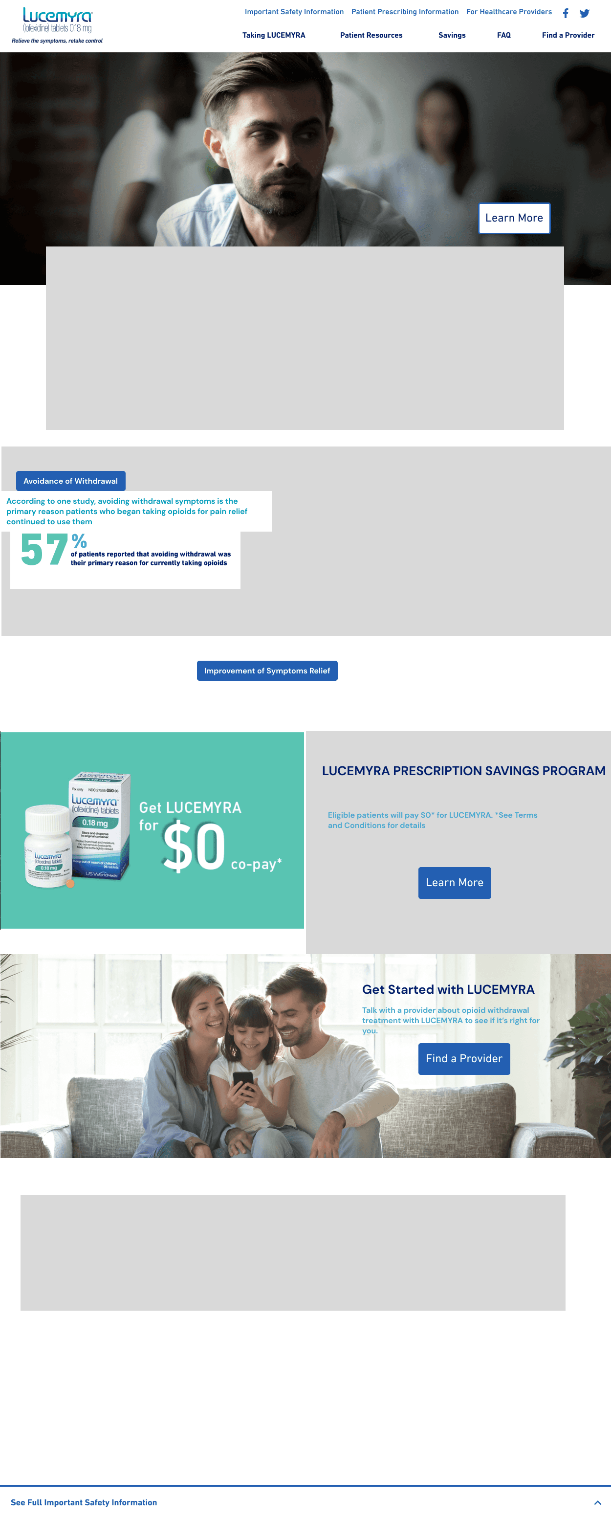
An early landing page design with negative to positive images to tell a story as the user scrolls
With access to USWorldMeds image content library, the product owners gave me the option to choose from their updated brand images for placement on the site. As a lover of visual storytelling, I was excited to try and build a story using the images of a person being given more agency in their life as the user scrolls down the page and learns more about Lucemyra.
However, it was also established that the branding wanted to move away from some darker imagery. For Image content, I ended up making two versions of the landing page.
One that used an uplifting hero image, and one that used a more darker hero image with the intention of building a narrative.
The second design, as the user scrolls down the model in the photos becomes more happy and engaged with his community, creating a simple narrative.
After discussing the imagery, we eventually moved forward with the narrative marketing imagery decision. I love story telling, so it was gratifying to find a way to show it in the site redesign, no matter how small.
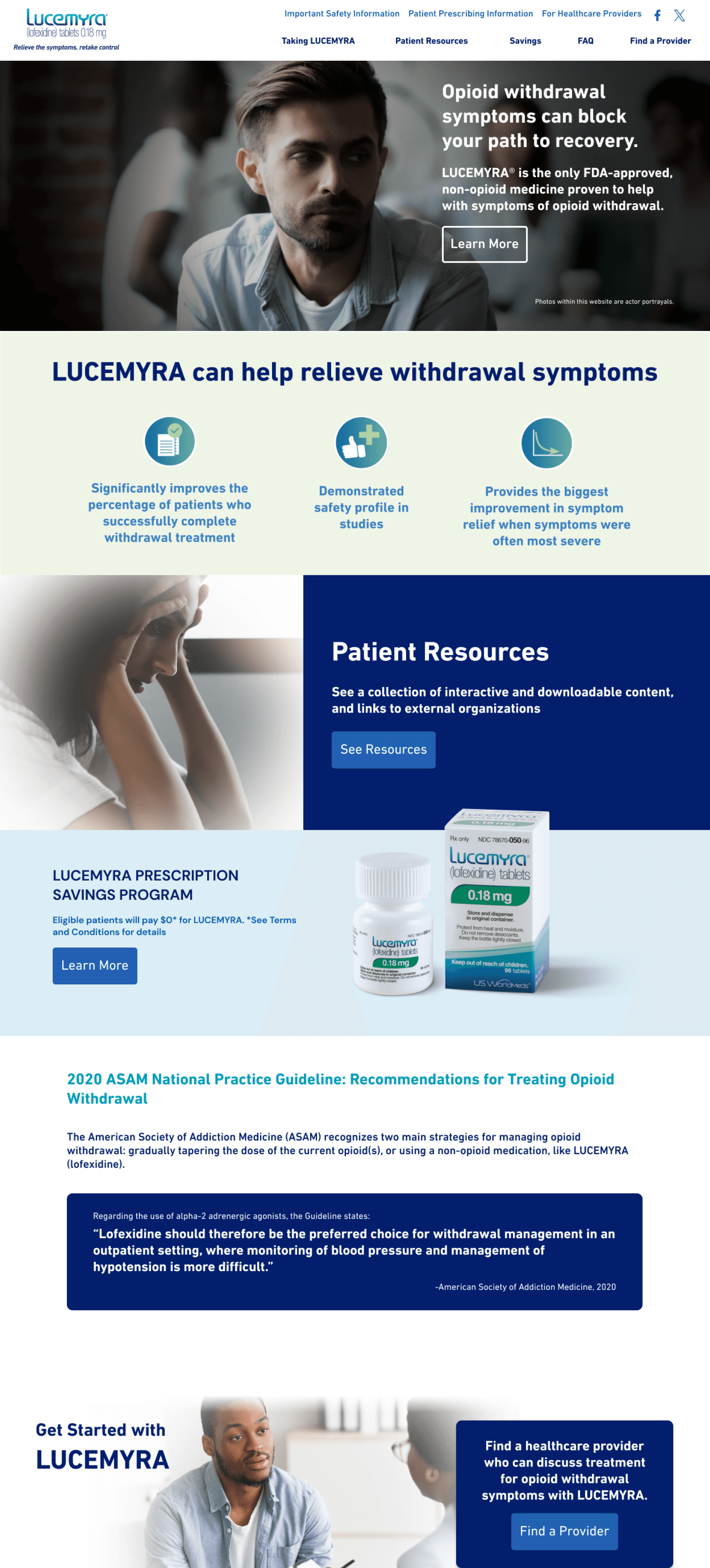
A Hi-Fidelity Mockup of the patient landing page
HCP Site
Deep Information
User HCP

Will be more familiar with medical terms, may want more details to feel they are informing their patient properly
Safety information and dosing guides should be easy to access, but can contain more detail to properly inform the HCP
For the HCP site, the biggest difference was a focus on content with more technical terms and deeper information, In terms of content, the HCP site featured more linked resources and informational graphics on safety trials for HCP’s to gain a fuller understanding of how LUCEMYRA worked on a medical level.
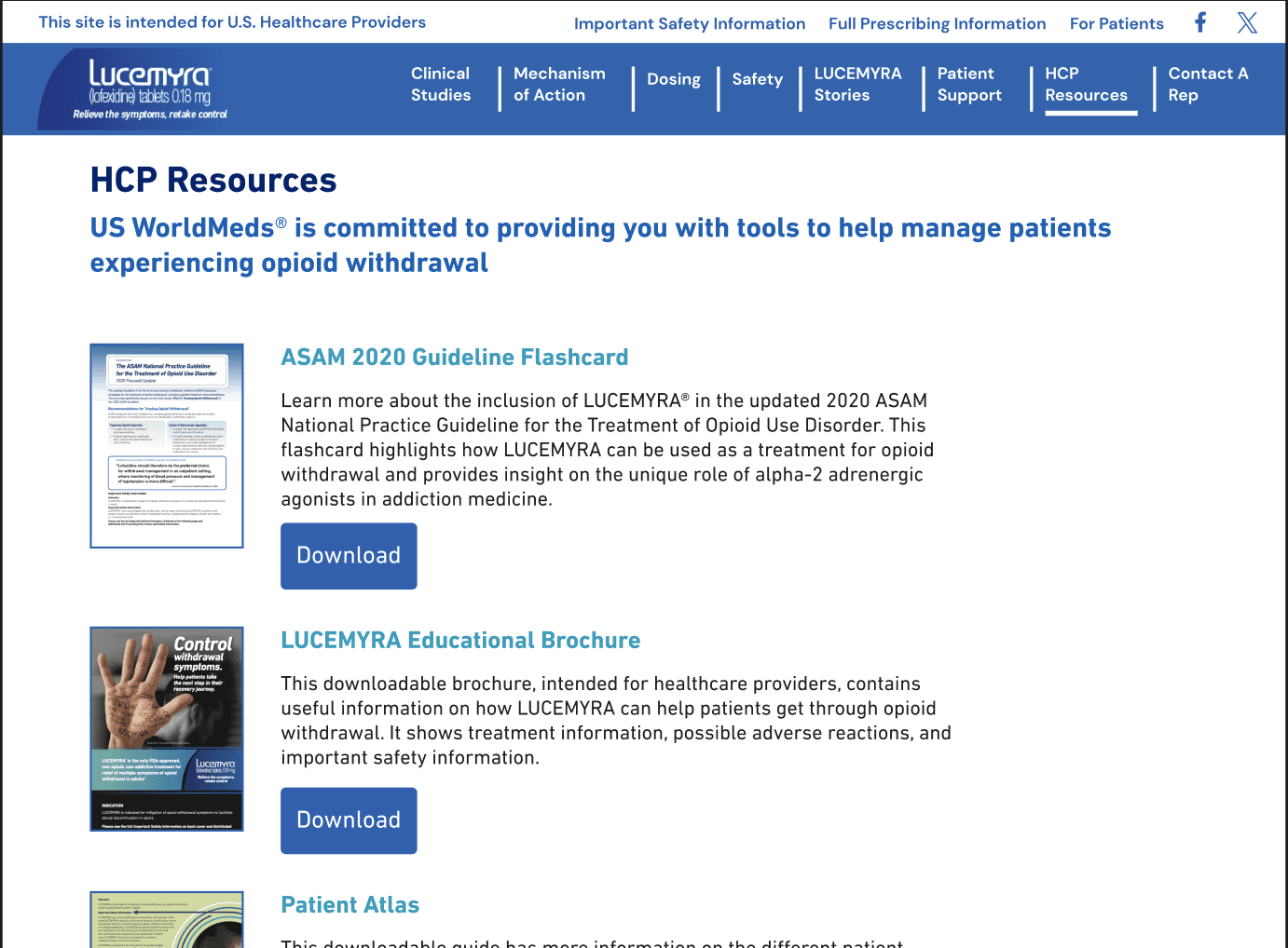
HCP Resources focused more on downloadable documents for HCP’s to easily download and print
Rich Content
User HCP

May be accessing from a desktop
Informational graphics should be easy to view and contain valuable information
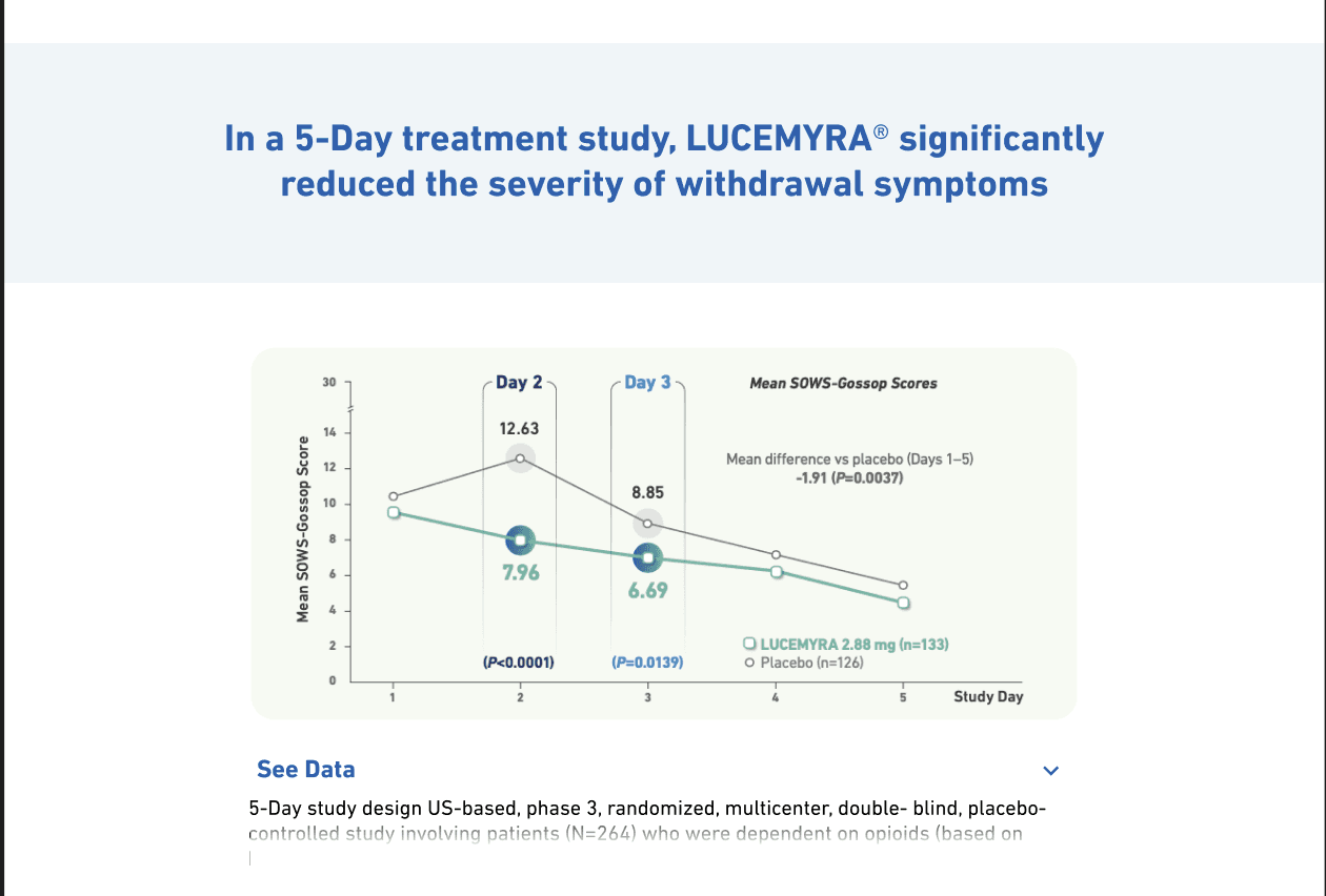
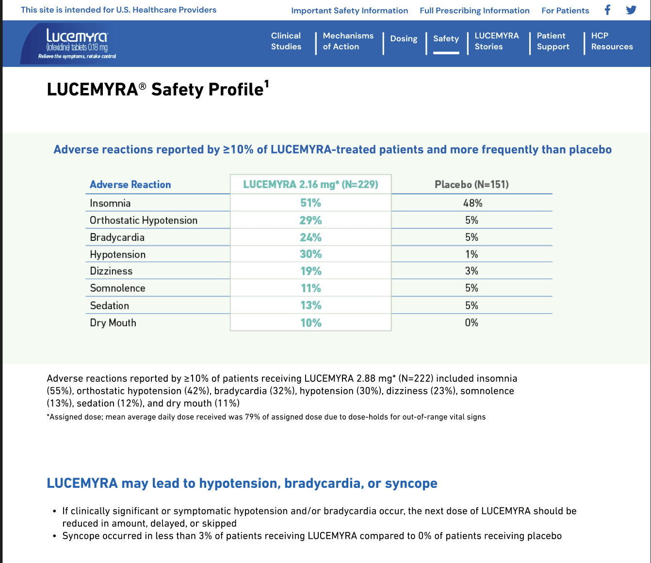
Part of the deeper content that would be featured on the HCP site included infographics for HCPs to see the safety profile for Lucemyra during test trials. The pages featuring this content were designed to highlight the graphics to be front and center for an HCP to be able to look through for deeper information, as well as accompanying information about the study though additional data information.
A timeline graph with extended data included in a drop down
A graphic info sheet of LUCEMYRA adverse reaction data compared to a placebo
Our biggest discussions during design review was the organization of information on a page, and ways to make sure that progressive enhancement could keep the flow of information manageable, while still allowing the viewer access to as much information as possible. With the updated brand styling, I tried to section information into manageable pieces that could easily be reorganized on the page as needed based on these review sessions. While at times it could make the design feel segmented, it helped for making quick changes for the team to see real time how information flowed on the page.
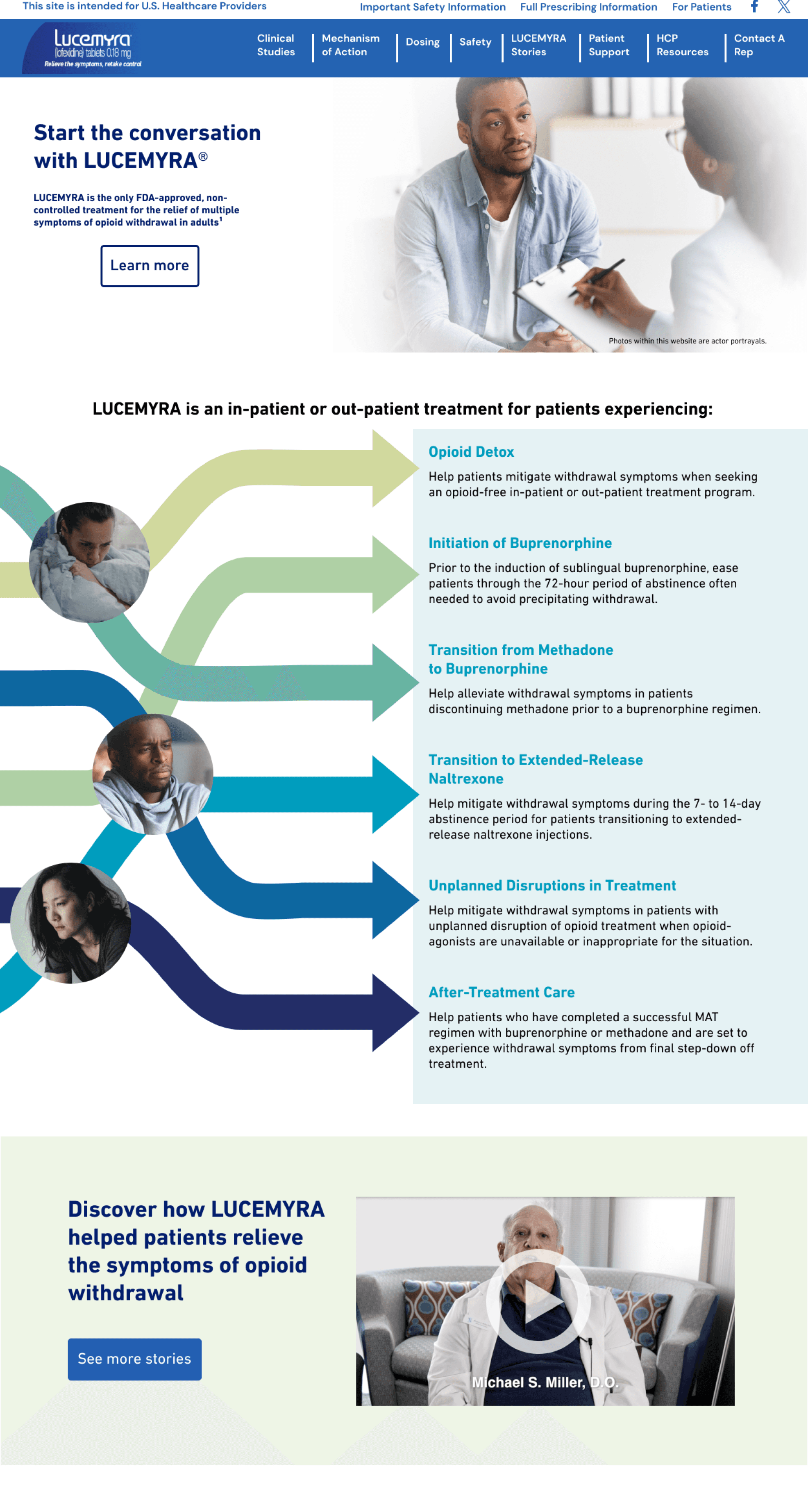
HI-Fidelity Mockup of the HCP Homepage using new graphics
Phase Summary
🌼Documented site interactions and links for new resource pages
🌼Demonstrated figma wireframes for the developers
🌼Worked with developers as quality assurance for links and responsive design
Site Handoff
Once we got the final approval from the legal team, I began to prepare the designs to hand off to our developer working on updating the site. Besides cleaning up Figma frames, adding notes, and organizing content, I realized that the site had a lot of linked resources to track.
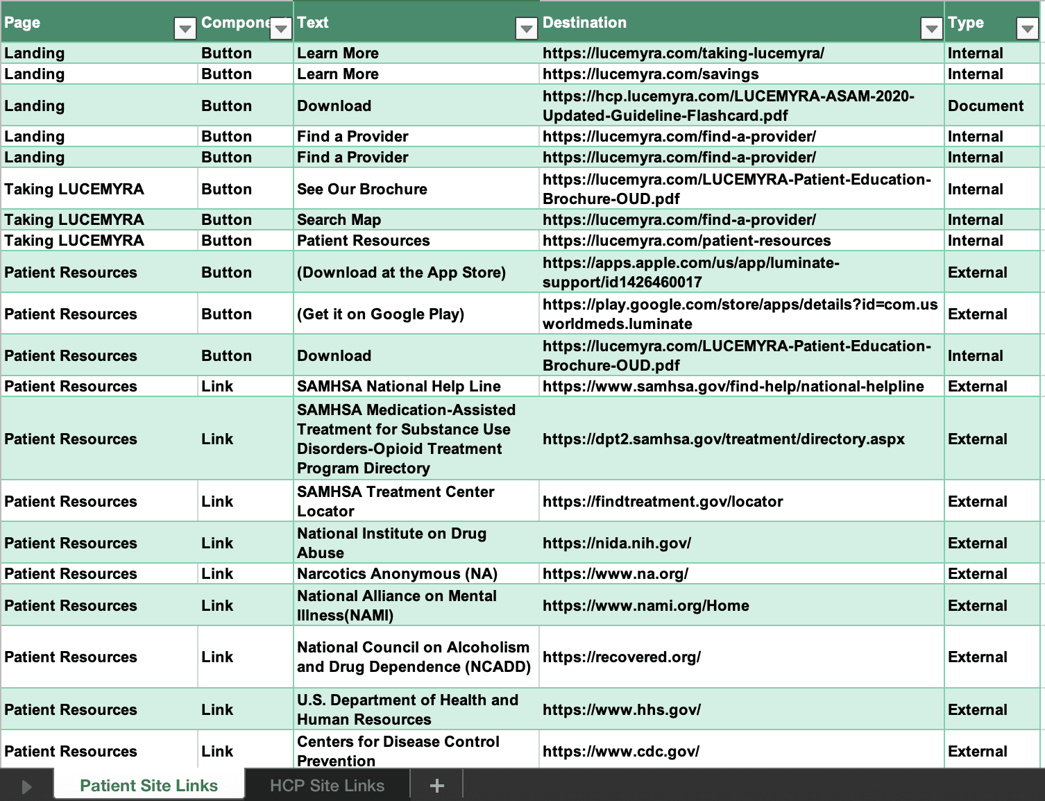
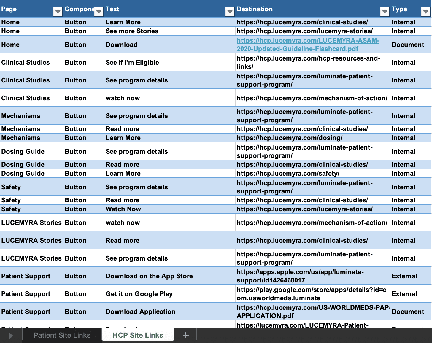
During the design process, many of the link destinations had been updated, and some overlapped between the patient and HCP site. To keep things organized, I created a content audit tracker specifically for all links on the site to keep track of the link types, destinations, and labels used for the developer. The excel tracker proved useful for last minute link updates as well added content that was added in development.
Content List for the Patient Site
Content List for the HCP Site
Conclusion
Things I would do next time
If I had more time, I would love to have done some user testing, but due to the constraints of my involvement in the role was unable to. I will strongly recommend it once the redesign is implemented.
Writing alt text for the information graphics. I mostly tried to copy as much information from the graphics as I possibly could for the alt text. Now I know that it is much better to simplify to the most important information instead.
When working on this project, I had not yet been introduced to the process of content audits. Now that I'm aware of the standard practice, I would have conducted one as part of the discovery phase, and made artifacts like the link excel reference much earlier in the design process than the handoff stage.
while I initially imagined that working on a website over a webapp would offer more creative freedom, I quickly realized that balancing the technical requirements and business interests took precedent in this redesign. Finding ways to ensure the designs would fulfil these needs ended up becoming a satisfying creative challenge in itself. I was lucky to have a very supportive team through my project manager and design lead that gave me support while also getting accommodated to my new role at Interapt, and feedback when prepping for workshops and design review sessions.
Since implementation, USWorldMeds has shown satisfaction by continuing to work with the developer and I to make content updates and additions as they grow more resources to offer to patients and HCPs on the site.

